Neville Page: Designing Sci-Fi Creatures and Characters
Creature and character designer Neville Page explored some of his most iconic creations: Avatar’s Banshee, Prometheus’ Engineer and Trilobite, and his fascinating work on the Star Trek franchise.
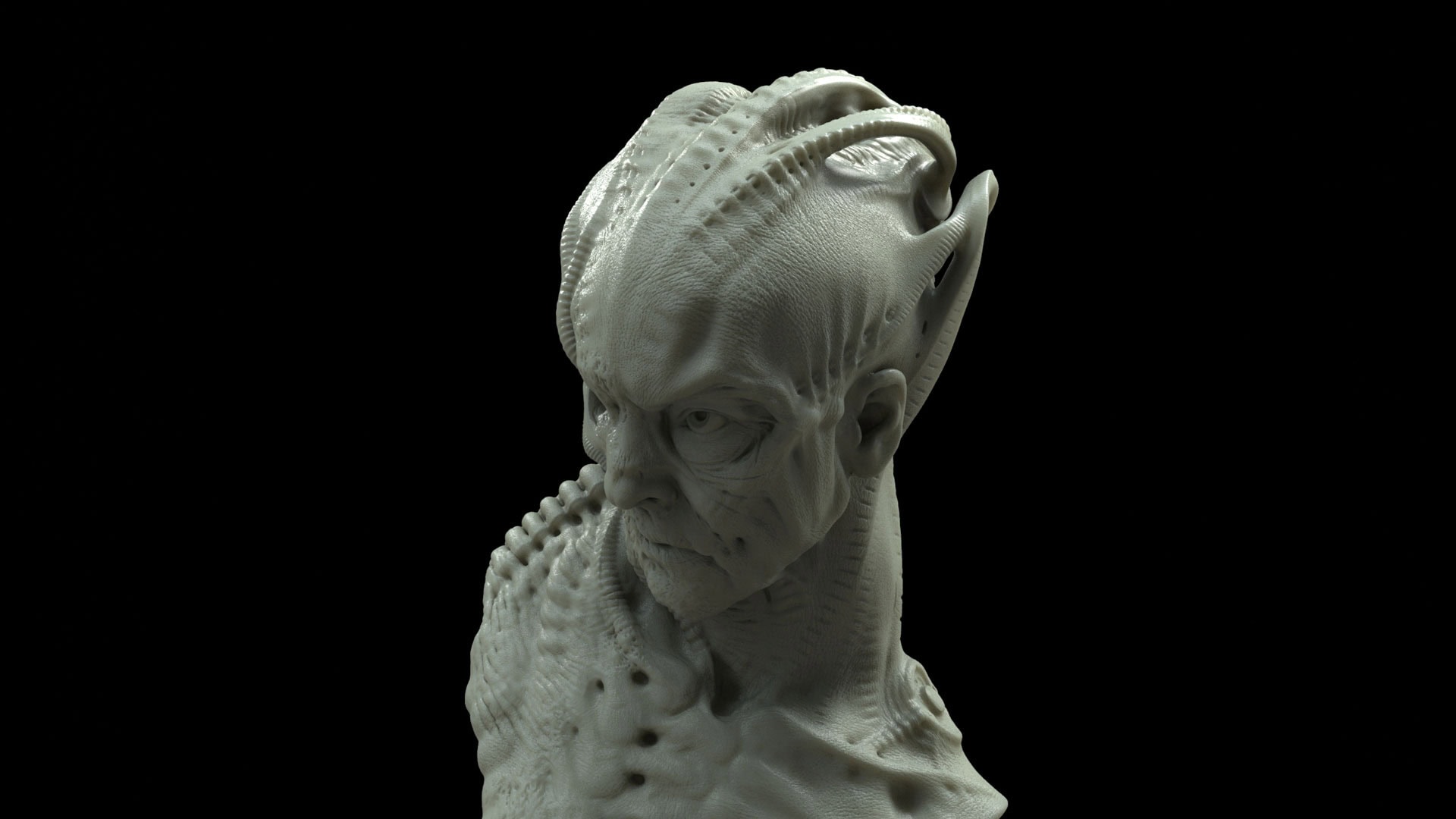
Before creatures and science fiction characters come to life on screen through the artistry of makeup and VFX, conceptualization is extrapolated from the mind of a writer/director by visionary designers. Over the years, one such individual has instilled a certain level of realism into fiction that is arguably unprecedented: Neville Page. The design of the breathtaking Avatar’s Banshee, the mysterious Engineers from Prometheus, and the incredible contribution to the Star Trek franchise starting with JJ Abrams’ reboot films onto the latest TV shows have brought these distant worlds close to the audience because of the intrinsic, almost DNA-level connections with our universe.
“To be an efficient and good designer is to really educate yourself about the real world of biology and physics. You can create anything, but that doesn’t mean it’s going to succeed as a design … if it’s plausible, the aesthetics come from that.”
His creations transcend beyond aesthetics. Neville Page’s process is one of deep research: “To be an efficient and good designer is to really educate yourself about the real world of biology and physics–understand what it is that primarily most people respond to in terms of the believability of something. You can create anything, but that doesn’t mean it’s going to succeed as a design … if it’s plausible, the aesthetics come from that.”
Avatar’s Banshee
Almost every filmmaker, especially in science fiction, wants to see something they have never seen before, which Neville Page said almost by definition never works–there has to be a connection to what we know, metaphorically. For Avatar, James Cameron gave the artists a really good sense of the world they were building—Pandora’s thick atmosphere for example—which informed Page’s understanding of the environment for the Banshee, the colorful creature that as the director described should be streamlined and sleek like a barracuda. This was the first flying creature Neville Page designed, so he approached it from an anatomical clinical perspective: “The first thing I did was buy a small dead chicken from the grocery store. I played with its wings and understood how it bent and where it stopped bending. I then dissected it after cooking it to really understand biomechanically how things move–coupled with expensive books to learn about avian flight. Am I an expert? No, but I’m good enough to fake it pretty well. It has nothing to do with the success of how it looks, it has everything to do with the success of it appearing like it can move properly biologically. As a creative person who’s tasked with creating something we’ve never seen before, you have the rules in place that you can bend and even break but sustain the illusion of plausibility.”
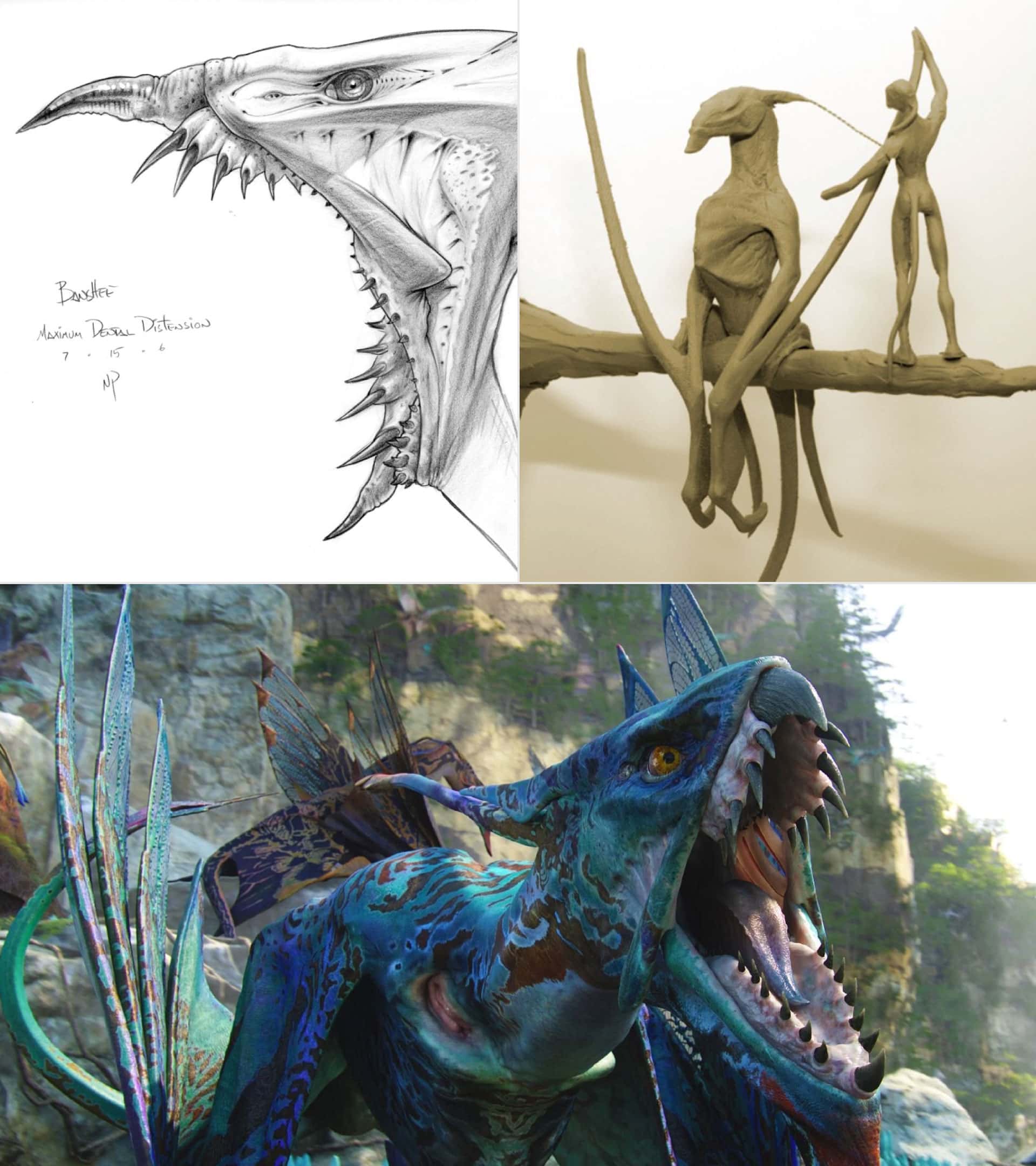
At the beginning, Page confessed there were not a lot of discussions with Cameron on Avatar. At the time, the director was out in the Baltic Sea studying the derelict of the Titanic for his soon-to-be blockbuster hit, so Page and the rest of the team had a certain level of autonomy that let the artists’ imagination run free. Working at Cameron’s house in Malibu were Page himself, Yuri Bartoli, Jordu Schell, and Wayne Barlow–each focusing on a specific creature for the new universe. He shared, “We all had a task to focus on, but at some point, we would need to make sure that our biological foundation rules were the same. We’re all figuring it out as we go along and being receptive to other people’s discoveries. Wayne Barlow infused a lot of incredible vision into all of us, same with Daphne Yap who came on much later.” The war room walls would then be decorated with all the concept art, where Cameron would step in and interact with the team–hashing out ideas, getting closer and closer to the target. “He’s a visionary, he knows what he wants. Not every director is that way, but Jim would grab our sketchbooks and draw in them exactly what we needed to do. From that standpoint, it was easy. All of us were self-motivated, so when he came back, he got stuff of value.” In the end, the final iteration of the Banshee was an unprecedented visual spectacle that, even though it was conceptualized from the standpoint of biological plausibility by Neville Page, the work that the entire team put into these creatures (and the film as a whole) truly brought the creature to life.
Prometheus’ Engineer and Trilobite
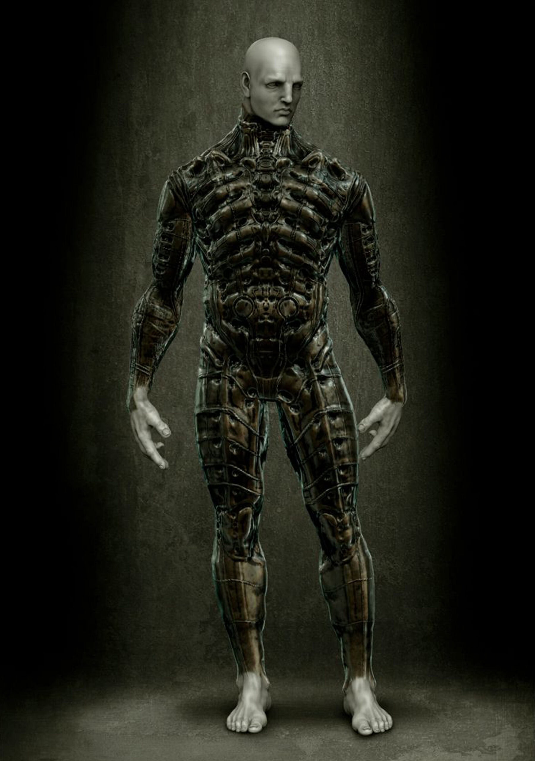
Prometheus uncovered the secrets behind the Space Jockey from Alien and unleashed new lore in the franchise. Neville Page was responsible for creating the Engineer, in which Ridley Scott had certain parameters for the design: “He was specific about wanting it to be classic Roman and Grecian sculpture–those particular shapes that are iconic. He wanted it to be 9ft plus tall for reasons that relate to Prometheus, Nephilim, and ancient alien theories. In the end, it’s a pretty simple thing … I’m creating a human being with proportions that are just large in scale. That’s not a hard job on paper, but it is one of the most subjective ones.” Page then revealed that, surprisingly, Scott did not want to incorporate the H.R. Giger aesthetic that has visually defined the Alien films onto the Engineer’s body–something that the creature designer respectfully disagreed with. “Although challenging to work on the human form, I was personally hoping to do the ‘Giger thing’ on him. People, especially me, want to see biomechanical surfacing. So one evening after a review of the Engineer costume, I said to Ridley, ‘Do you mind if I explore a couple different things for tomorrow morning?’ He said yes, and so respectfully I gave him the stuff I needed to do first and then got up a little early that morning and spent 45 minutes on two real quick ideas of Giger aesthetic costuming. Rather than try and copy (which can slow you down), I interpreted it so at the very least it’s going to be slightly different for Ridley and not feel entirely Giger. I freestyled it and Ridley’s first reaction was, ‘Oh my god, this is it.’ I thought to myself, I spent months trying to come up with something great and in 45 minutes I came up with what he felt was great. I realized at that moment that there’s no reference to how long it takes to do something. That’s how we came about it, and it just worked out.”
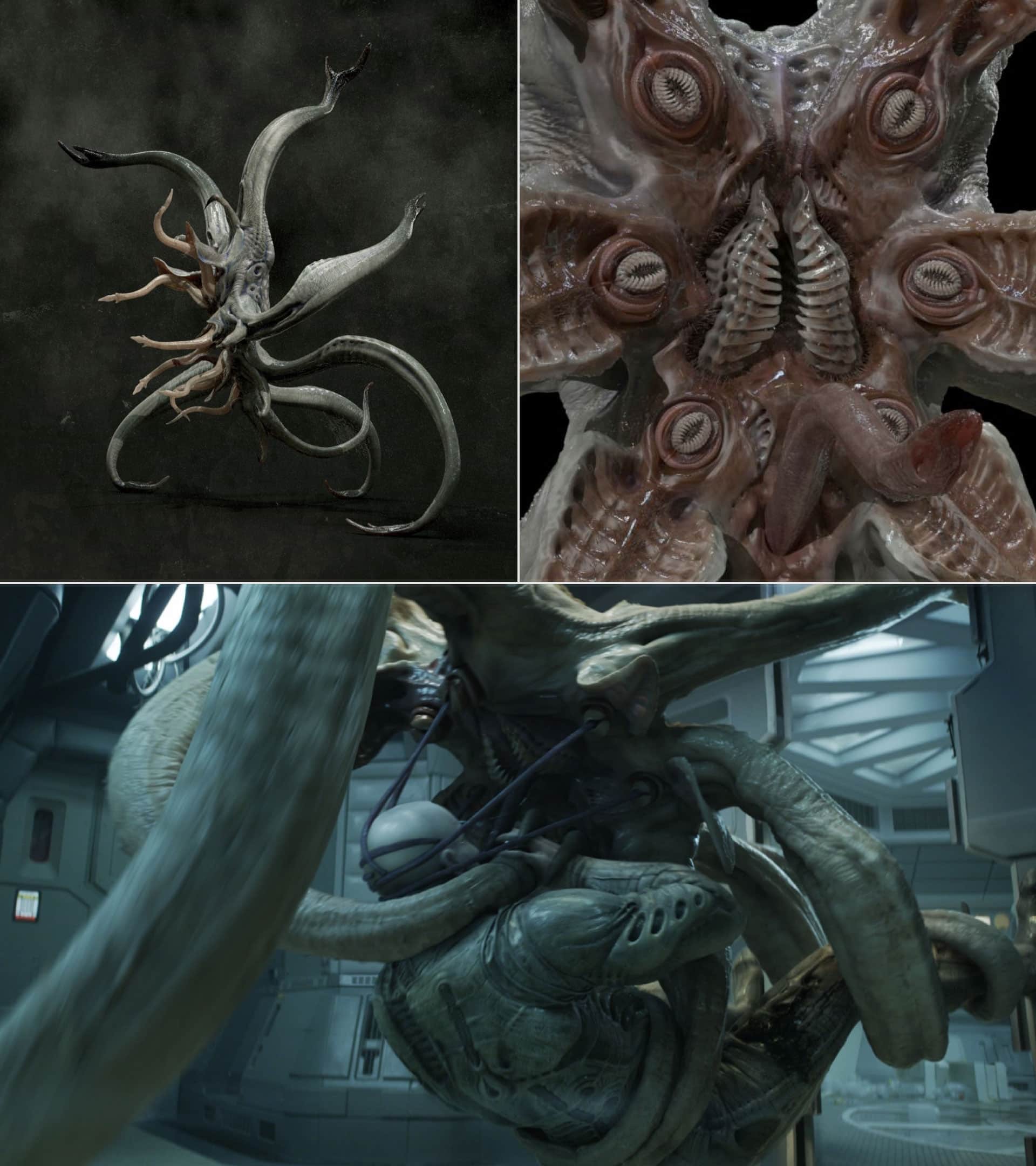
A few months after finishing his work on the Engineer, Neville Page was called once again to contribute on the Trilobite, the giant facehugger by which the Space Jockey meets his end in the final act of Prometheus. Up until then, the art department hadn’t quite nailed down the design for the terrifying creature, but Ridley Scott liked the direction that visual effects art director Steven Messing was heading toward–evolving the crab-like design of the original facehugger into an octopus-inspired alien creature. Page explained that the trick to make this creature really ferocious was its movements, so he brought in longtime friend and collaborator Alex Alvarez. “I designed a quick octopus-like thing which ultimately was what it ended up being minus details, and Alex knocked it out of the park. He did such cool stuff, and that really helped Ridley understand its potential of performance. The challenge for me was coming up with a way to not have it look stupid. How does an octopus stand on its tippy tentacles? I came up with this metaphor of a chimpanzee/gorilla … they do this knuckle walk, so I thought, let me bend the end of the limb and add a claw so it can have this walk to it, but with eight legs. I gave these poses to Alex, sort of key frames to show how it would raise up and expose all the stuff we wanted to see,” he explained.
Once the mechanics were proven, Page planted a seed of subconscious disturbance by giving the Trilobite seven tentacles (as opposed to eight of an octopus): “There’s rarely an occurrence of seven in terms of sacred geometry. You take a circle and divide it by eight and you get a solid number, you divide it by seven and you have this infinite fraction. I thought that might just convey a sense of something unsettling that you cannot put your finger on.” Finally, as part of the underside of the creature, Page infused the design with a concept that conveyed the scariest, most horrifying thing to an audience. The result was a fascinating display of snail-like labial folds that was misinterpreted as a sexually-inspired design, which despite being part of the H.R. Giger aesthetic, Page confessed it was not the true source of reference: “I wanted to make something biologically cool in its morphology, in its utility. I didn’t need to look up Giger’s work because I love it so much. I have his aesthetic filtered through me which can be an offensive sounding thing for many Giger fans. It’s a reality that there are similarities between human genitalia and so many other things [in nature], it’s just that humans tend to personalize and own something. You open up a mussel and there’s very much labial-looking folds. You look at a sphincter. Now, eyelids are sphincters, and obviously, anuses are sphincters. They all are supposed to be doing the same thing … it’s a doorway to a physiological activity. If you think it’s a penis, it could instead be the stamen of a bird of paradise plant. Even though in an interview behind-the-scenes I said it’s a ‘celebration of labia’, it’s not a celebration of women’s labia, it’s a celebration of labial folds that exist in all sorts of things. I’ve been called out on using porn as a reference, but I can pull up the exact reference [I sent to the VFX team] of snails inside of an aquarium–how that claw comes in and out scraping off the algae. It was the only way I could easily articulate how I would love the animation to look.”
The Klingon Evolution
Since their first appearance in Star Trek, the Klingons have been a predominant group in the franchise’s storytelling. Driven by makeup and budgetary limitations of time, the warrior species’ look has evolved over the course of generations–starting as simple facial hair and bronzer to photo-realistic prosthetics. The most defining makeup designs for the Klingons were the ones created by Michael Westmore for The Next Generation–bringing the ridged foreheads, long hairstyles (including facial hair), and specific skin color that up until JJ Abrams’ reboot remained consistent. However, with the Star Trek lore continuously expanding and more societal complexities being introduced to storytelling, the cultural richness (which can be mirrored to our own) demanded variety to represent different clans, ethnicities, and personalities among the Klingons. Although a new iteration of the species was explored but never fully realized on screen in Abrams’ Star Trek, in Discovery the Klingons are fully featured with new, bold designs that radically departed from Westmore’s iconic looks. Neville Page–who has been designing the new era of Klingons since the 2009 Star Trek film, feels like it’s a fortuitous opportunity to have been able to stay on the franchise this long–giving him the rare chance to try something, learn from it, then do it again with an evolved point of view: “If you enter into a franchise, you kind of know the language, but given newer tools, you can design things at a higher level of resolve, both cosmetically as well as biologically. Technology allows us all to do something far more advanced. That’s what we were doing with Star Trek. I think it’s important that you hear the fans, but it’s equally as important that you provide something to them that they didn’t expect, and that can fail.”
Although Abrams’ first Star Trek film only featured helmeted Klingons, next installment allowed for a full reveal. Neville Page confessed that the designs he created had some interesting shapes and details that felt pretty strong and appropriate for the fan base. The new exploration of the forehead ridges, exposing the head by omitting the typical long hairstyle which carried onto Discovery, sparked outrage among the more traditional Star Trek fans. “As soon as you start altering all the components that create the classic Klingon, you’re deviating from the expectation. So we created a new expectation, and the moment we did bald Klingons it didn’t work. It’s been done before! We’re going bald because we’re going to give you something more to talk about, to experience.” Page added, “These Klingons are not the ones we’ve seen before in terms of the culture and tribe of clans. They are into the arts; they are into aesthetics … they’re into good food and wine. They’re still warriors, but how they choose to comb their hair, to decorate their rooms, this is a different group.”
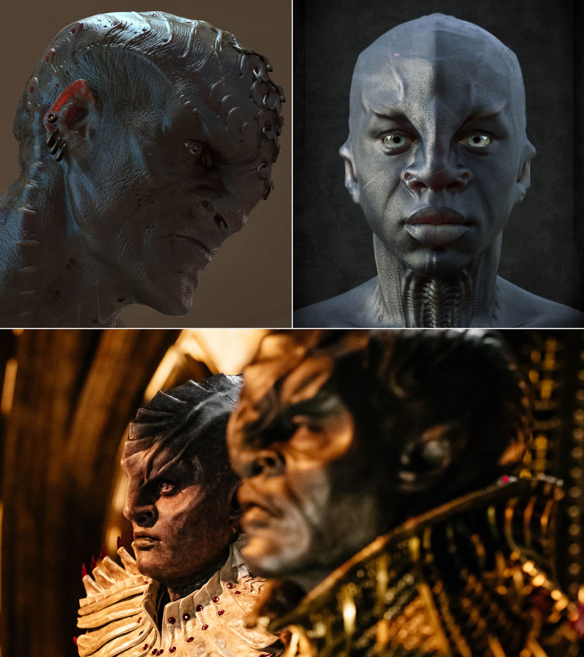
Page admitted that by virtue of passing the baton, what ended up on screen was not exactly what he imagined–the ambitious design push deviated too far from what visually defines a Klingon by creating bold features that could not be fully realized because of monetary limitations. “[The filmmakers] wanted to take the eyes of the actors and make them bigger and wider in post-production. We did a test and it was cool but too expensive. What happened was we ended up with these vestigial elements from other desires that stayed on, but were no longer balanced because we couldn’t afford it. Now we have this giant head and tiny little eyes inside of it. I think in the end the mistake was deviating too far from the things that are important to the audience, focusing on a fairly big change in aesthetics when the focus should have remained on the story. This departure, cosmetically, was a distraction to the very important narrative. A lesson was learned, and this is where Worf [from Picard] was the answer to what we should have been doing. If you want to present change, and you know that society and human beings react a certain way, it might be incumbent upon you to spoon-feed the change over time and let those who have opinions grow with you. It might sound nefarious, but I think it’s important if you want to change something, whether it is Klingons, sexuality, political opinion, or religious doctrine,” Neville Page explained.
Saru
Without a doubt, the most iconic alien in Star Trek: Discovery is Saru. Neville Page’s design, paired with Alchemy Studios’ makeup and Doug Jones’ performance, delivered an unforgettable character that is now immortalized in pop culture. The Kelpien’s origins are incredibly fascinating since what started as a supporting member of the crew organically became a key character because of the inspiring design process behind it. Page revealed that the initial design for Saru was drastically different–a hammerhead-like, multi-eyed alien that would have led to performance and production difficulties: “I had a tough time with that design. Multiple eyes … there’s a redundancy there that just biologically doesn’t make sense. It’s very Guillermo [del Toro], like you’d see in Pan’s Labyrinth (which I love) but he is sometimes more mythological in his approach to his creature designs. Star Trek is honest with its science, so you have to be careful with throwing out some of these ideas which are just lunatic. I think it was executed fairly well, but I just didn’t feel like it was the right answer.” Moreover, operating servo-driven or implement digitally animated eyes would have been very expensive and add more unnecessary complexity for what was trying to be achieved. The catalyst for a complete redesign was Doug Jones–Neville Page and makeup artist Glenn Hetrick’s dream casting for the role of Saru.
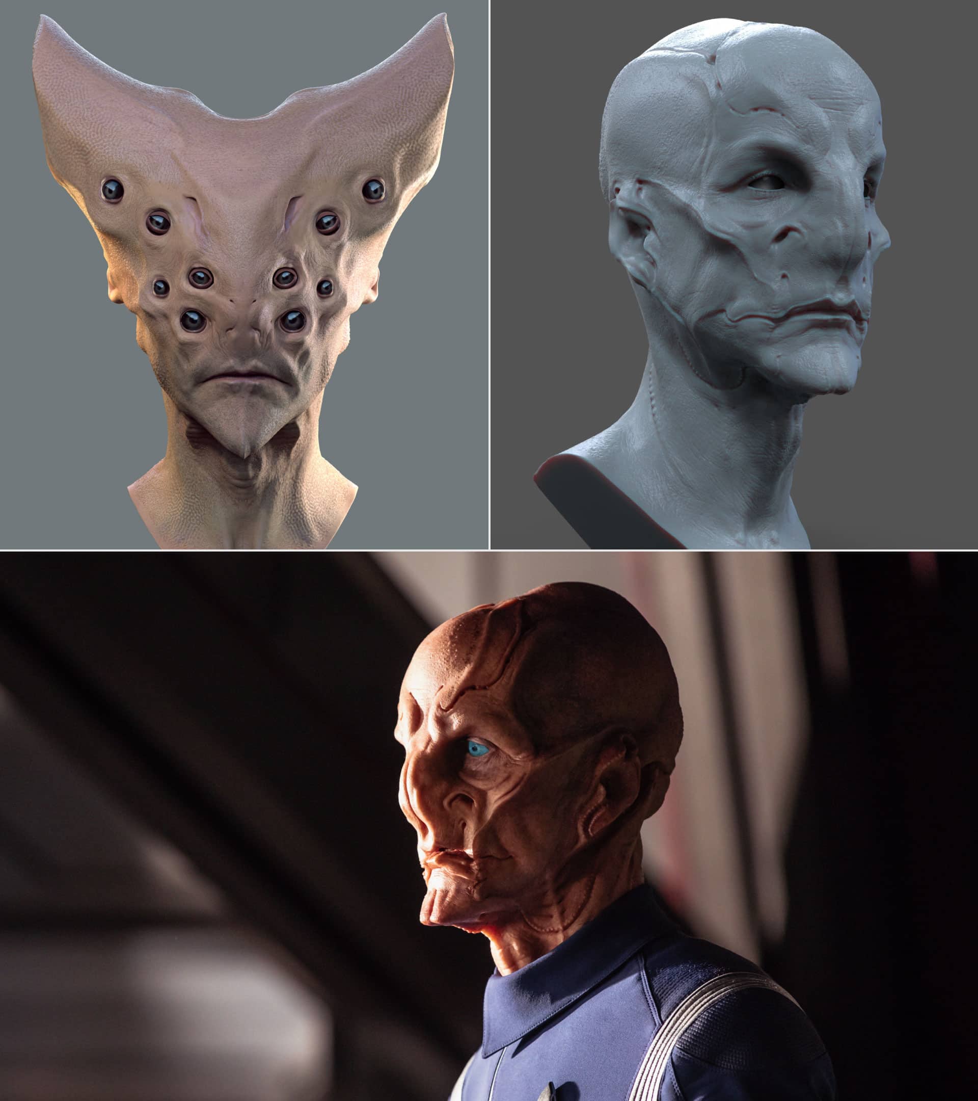
Despite the actor’s schedule overlapping with another project, del Toro’s The Shape of Water, Discovery’s producers were able to cast Jones for the role, and after a four-hour application of the v-shaped design, it was undeniable that this would not allow the actor’s talent to surface through the makeup and truly shine. Page shared, “We spent months doing Saru. I had to tap into sort of my go-to form language, things that I would normally do quickly because there wasn’t a whole lot of opportunity to reinvent the wheel. There’s a lot of things that I tend to gravitate towards–strong cheekbones with a rigid line, baldness because we just don’t want to do hair.” He added, “There are things in the design … nobody said anything about this being aquatic, anything about it needing extra sensory perception. I’m adding non arbitrary, interesting lines to him that if there’s an opportunity, we could turn it into something and justify its utility.” When the time came to do another makeup test on Doug Jones, the actor was thrilled because he could finally emote the kindness, the empathy, and all the character traits that Saru embodies. “I’m not going to say that because of my efforts and Alchemy’s efforts that character was chosen to be on the bridge as a more significant character and therefore Doug had several years of work … that would be quite presumptuous and arrogant for me to say. I do think that by doing your best and having the foresight of all of these non arbitrary, nonsubjective decisions, you create a product that others see its value and feel inspired by. I participated in the success of it by providing a solid foundation,” Page said.
The Borg Queen
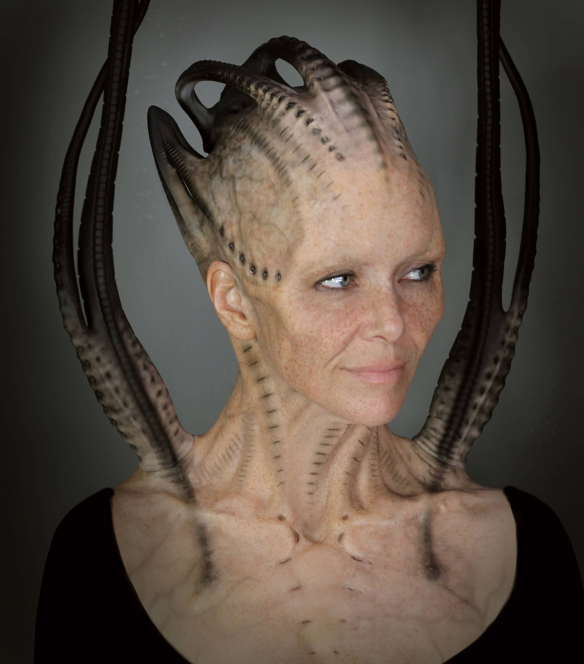
The third season of Star Trek: Picard featured yet another stunning design by Neville Page: the Borg Queen. Arguably his most Giger-esque creation outside of the Alien franchise, this character was a showstopper for many reasons, but what really makes this design so special is its behind-the-scenes story. Page wanted to honor the iconography of what has been done in First Contact, and interestingly enough, the original Borg Queen was inspired by Captain EO’s Supreme Leader (played by Anjelica Huston), which in turn was inspired by Giger’s work on Alien, so there was an opportunity to lean into these references and make the new Queen’s design even more biomechanical. “I took the more organic version of the Giger aesthetic, particularly the tubes that come out of the shoulders and the pieces that make the crown. In the end, it was the mastery of the makeup artist, Vincent Van Dyke, how we collaborated together. There’s design changes happening that have nothing to do with aesthetic desires but everything to do with technical fact. I enjoy that … that’s the industrial designer in me,” he shared.
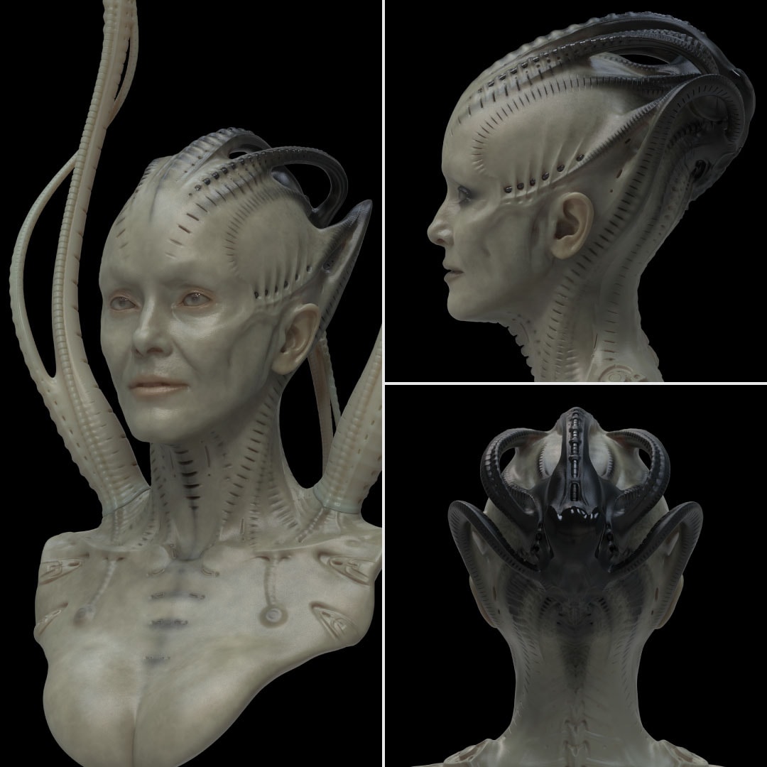
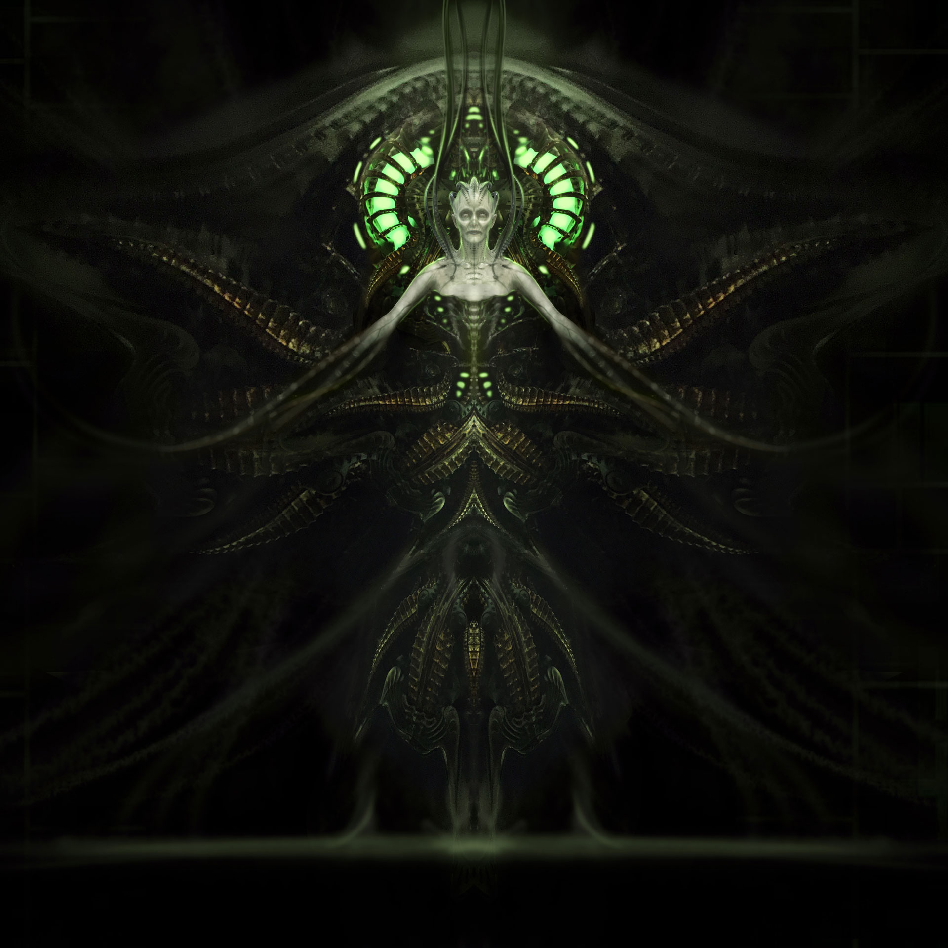
Taking a step back in the past, the design for the Queen was foreshadowed by another Borg: Seven of Nine. Jeri Ryan’s character needed an update for her iconic eyepiece: “Technically, it should be the exact same makeup. [In Star Trek: Voyager], they did what they did with the time, the tech, and the resources they had, and it’s a little rough in areas. We should sustain the iconography and polish it up. I kept the general layout and communicated first with Jeri Ryan to make sure that she agreed that these upgrades were appropriate for her before I showed it to anyone else. It’s her character. She owns it. I’m allowed to participate and play in her sandbox, but I want her to be comfortable with what we’re providing. Then I just started thinking, if we get to do the Borg, I’d like to do some of these forms to polish their aesthetic, should we have that opportunity down the road.” Eventually, this new design evolved into the Queen’s lair (which in the end didn’t get used due to budget). Page explained, “The Queen’s lair was built out of components of the Seven of Nine eyepiece and the Borg Queen neural core. There was a sense of cohesion, but it felt Giger, felt Borg. Giger would buy vertebras and then add clay to it and buy corrugated tubing. It’s repetition … nature does it, crinoids and ammonites. Respect to Giger for how he utilized those references, and when people say, ‘You’re just copying Giger’, I’m copying the stuff that Giger copied.”
What truly made this character design so important at a personal level was Page’s collaboration with Annie Wersching who played the Borg Queen in Picard. After a computer scan done by Vincent Van Dyke, they discovered that the actress had an implant under her skin, a port underneath which distributed medication for cancer. “I asked Annie, ‘The Borg Queen is made of objects planted on and in, and you currently have an implant. Do you want to celebrate and embrace it in the character design? Can we glue rubber over the top of it or should we stay away from it?’ Her comfort level is the most important thing, not the design that I want. She gave us permission to incorporate it, so I made it symmetrical and embraced it as a bit of Borg tech. She loved the idea because it was a way of kind of turning lemons to lemonade with whatever she was going through. Ultimately, she died shortly after of cancer which was really tough on a lot of us. We got to honor her in a really cool way,” Page revealed.
Neville Page’s incredible contribution to TV and film is truly inspiring and is not stopping any time soon. He confessed that he feels incredibly privileged to have been given the opportunity to create for thousands and millions of audiences, and he teased a future passion project he has been crafting: “Getting to tell my stories is an even greater privilege … It’s my message, and I feel like it’s going to relate to people.” If you are interested in learning more about his work on Star Trek, then make sure to pick up Star Trek: The Art of Neville Page by Joe Nazzaro and don’t forget to follow his Instagram account for more creature and character designs.
